Choose Your Path For Expert Coaching & Leadership


Choose Your Path For Expert Coaching & Leadership


- Passion -
Author & Speaking Coaching
Why did I write my first Book?
Digital Transformation: I wanted to share what I had learned about delivering successful solutions that drive business’s forwards to greater success and improve the lives of those working in them and realised that writing a book was perhaps the best option.
Along with my colleague, we identified the Significant 7 Imperatives for Delivering Successful Change in Complex IT Projects, that came up time and again in all our successes.
Having worked across a wide range of sectors from Pharmaceuticals, Aerospace companies, Universities, Councils, Motor and Drinks manufacturers, Airport operators, hospitals through to countless smaller businesses.
I have advised thousands of company IT users and improved the way they interact with their IT devices and consume IT services.
These include companies such as HSBC, ITV, Spire Healthcare, Kinstellar, Heathrow Airport, Novartis, GlaxoSmithKline, PAREXEL International, Manchester Airport Group, Edinburgh Airport, University College London, Close Brothers, HSBC, ING Bank, Global Collect, Platform Smart, Affini Technology and Comms-care.

- Performance -
Fitness & Lifestyle Coaching
Would you agree that today, in this modern, digital, ever connected world, that we all live incredibly busy lives?
Maybe you are juggling the demands of a thriving, or potentially surviving, business, or a successful career, with the love and attention you want to give to your wonderful family. Meaning that you find you have little time left over for anything else.
Perhaps you also want to spend time with friends and helping those around you that need it or have assisted you in the past when you needed it. Leading to frustration or disappointment when you can’t be there for them.
Potentially that leaves you in a position where you don’t have your needs met. Whether those are your conscious desires or the unconscious necessities, the ones that your body has. Where one day you wake up and wonder what happened? Where did my body go? Why does it ache so much? What is that pain? Or, as I had, why is it so hard to get out of bed!
Yet how would it feel to gain the fitness, the health and the lifestyle that you are delighted with? Being able to wake up everyday knowing you’re physically at your best for whatever lies ahead.
What if you had the freedom and flexibility to fit in to your life what it takes to gain that fitness and lifestyle? Gaining that healthy body and mind that fits around your schedule. Imagine what you could do with the extra energy and focus that comes with being physically fit and healthy.
What areas of your life would benefit and what doors would open up to you? Picture being able to spend your time fully present, enjoying activities and incredible experiences without your body holding you back. The freedom to choose and take advantage of what life brings up.
And here you have the ease that comes with knowing I’m doing the right things for my body and my life? If you are a busy Entrepreneur, Consultant or Exec as I am, you are probably wondering “how can I achieve that in my incredibly busy life?”Now, as many people started to ask me how I did this, looking back I realised there were just 6 areas that I needed to work on, that made me fit for life.
- Prosperity -
Business Consulting & Coaching
I have worked in the IT industry since 1993 and have developed an eclectic variety of skills in management and strategy along with a breadth and depth of technical knowledge and experience. Clients have described me as ‘Knowledgeable, personable, refreshing, unbiased, diligent, help!‘ ‘A breath of fresh air in a world where IT complexity often seems to create as many challenges as it solves.’
As an Enterprise Architect, IT Solutions & Technology Consultant, I believe in being an enthusiastic leader, helping companies to structure their IT so that it becomes a business enabler not a barrier to communication & growth.
While working with many of my clients it became apparent that there was a need for some of them to have one-to-one guidance. So I now offer my services to a select number of clients, as a IT Leadership Expert.
For your business or company, the service I office is like having a IT executive come in to help you create a strategy, and plan, for your marketing, helping you to save money on wasted initiatives and building a sustainable environment for continuous improvement.
For the individual, it is having that trusted 2nd opinion, the 2nd pair of eyes and career confidant. A coach and mentor to help you improve your skills, reach your goals and avoid the mistakes of others.
Trying to grow a business or enhance your career can be stressful and time-consuming, but the result of working with me as a coach & mentor means the client has the confidence to take measured risks to increase revenue, capitalise on identified opportunities and get others to drive it forwards with them.
- Supporting Charities -

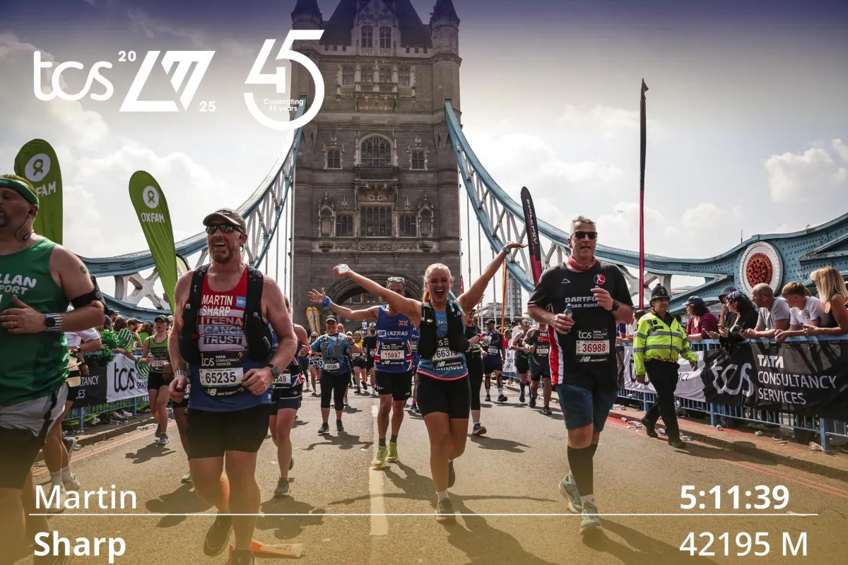
Martin Sharp 2025 TCS London Marathon Completion Time
"Be good to yourself today, so you can be good for others tomorrow."
That’s not just something we say, it’s how we live, and it’s the heart of everything we support. When you take care of your body, your mind, your heart and your spirit, something powerful happens. You lift yourself, and suddenly you’ve got the strength to lift others too.
Families, friends, teams, communities and everyone around you benefits when you’re fuelled, fulfilled and firing on all cylinders. That’s why we proudly support charities that are doing the real work, helping people rise, recover, rebuild and realise their own strength.
These organisations reach those who are struggling and offer a hand, a voice, a place to start again. And by backing them, we’re putting our ethos into action. Every donation, every share, every show of support makes a difference.
If you’ve ever said, “I wish I could do more,” this is your moment.
Be good to yourself, then join us in doing good for others.

Martin’s Epic Triple Marathon challenge fundraiser for Teenage Cancer Trust
My Story
Cancer has deeply touched my family. We lost my uncle to pancreatic cancer, my father survived thyroid cancer, and my cousin’s brave daughter, diagnosed with Hodgkin’s Lymphoma at just 14, fought valiantly for five years with the support of the Teenage Cancer Trust.
The Teenage Cancer Trust provides life-changing care for teens battling cancer, and every donation helps them continue this vital work.
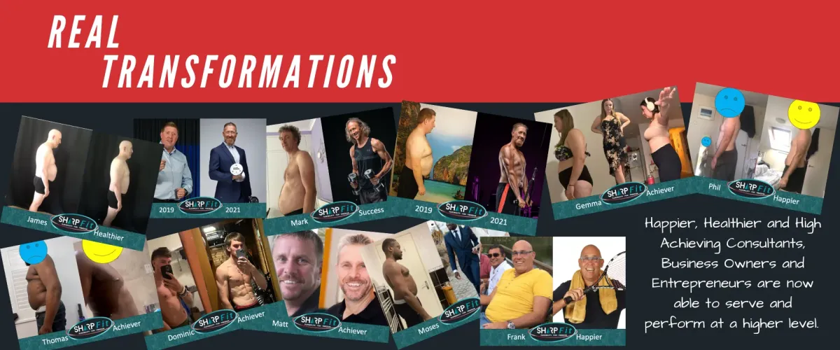
In 2014, my health hit rock bottom at 154kg/340lb and a 54” waist. By transforming my lifestyle, I lost 60kg/133lb in two years and discovered a passion for helping others achieve fitness and confidence.
Now, I’m taking on my biggest challenge yet—running three marathons in 14 days: the London Marathon, Milton Keynes Marathon, and Rob Burrows Leeds Marathon. As an asthmatic who started running less than a year ago, this journey is both daunting and inspiring.
I’m running to raise funds for Teenage Cancer Trust, a cause close to my heart.
About Teenage Cancer Trust
Every day, seven young people aged 13-24 are diagnosed with cancer. Teenage Cancer Trust ensures they receive expert care, support, and hope for the future, empowering them to live their lives beyond cancer.
Join the Mission
Help me make a difference! Click below to donate and support Teenage Cancer Trust.
Discover Insights
Dive into our expertly crafted articles designed to help busy professionals like you script a stress-free schedule, sculpt a stronger body and build a thriving business. Our blog is designed to inspire and empower you to become the best version of yourself with Passion, Performance and Prosperity.
Martin Sharp Featured on Yowah Radio with Steve Twynham | Insights, Lessons & Tips from his transformational lifestyle journey
Martin Sharp is on air with Steve Twynham - Inspiring People Across The World this morning at 7am! In this episode, Martin discusses and shares insights, lessons and tips from his transformational li... ...more
Press & Media
November 10, 2025•0 min read

Preparing To Climb Kilimanjaro | The Ultimate Bucket List Adventure!
Martin Sharp is heading to Tanzania, Africa, to begin his next epic adventure, where he plans to conquer Mount Kilimanjaro! His trek up the mountain begins on September 15th! After months of training... ...more
Performance
September 12, 2025•3 min read

Martin Sharp Featured in Readly | Woman Own Magazine | Practical Travel Tips to Keep Moving
Martin Sharp Feautured in Readly | Woman Own Magazine | Practical Travel Tips to Keep Moving ...more
Press & Media
August 15, 2025•0 min read

Discover Insights
Dive into our expertly crafted articles designed to help busy professionals like you script a stress-free schedule, sculpt a stronger body and build a thriving business. Our blog is designed to inspire and empower you to become the best version of yourself with Passion, Performance and Prosperity.
Martin Sharp Featured on Yowah Radio with Steve Twynham | Insights, Lessons & Tips from his transformational lifestyle journey
Martin Sharp is on air with Steve Twynham - Inspiring People Across The World this morning at 7am! In this episode, Martin discusses and shares insights, lessons and tips from his transformational li... ...more
Press & Media
November 10, 2025•0 min read

Preparing To Climb Kilimanjaro | The Ultimate Bucket List Adventure!
Martin Sharp is heading to Tanzania, Africa, to begin his next epic adventure, where he plans to conquer Mount Kilimanjaro! His trek up the mountain begins on September 15th! After months of training... ...more
Performance
September 12, 2025•3 min read

Martin Sharp Featured in Readly | Woman Own Magazine | Practical Travel Tips to Keep Moving
Martin Sharp Feautured in Readly | Woman Own Magazine | Practical Travel Tips to Keep Moving ...more
Press & Media
August 15, 2025•0 min read

Multi-Award Winning Mentor, Coach and Trainer
Martin at Public Speakers Academy Awards night 2024 for Making over £1,000,000 helping others

Multi-Award Winning Mentor, Coach and Trainer
Martin at Public Speakers Academy Awards night 2024 for Making over £1,000,000 helping others

As Featured In


As Featured In


Get In Touch

Speak To Our Team
Have a question? Fill out the form below and we will get back to you.
Get In Touch

Speak To Our Team
Have a question? Fill out the form below and we will get back to you.
- V Babber -
"Thanks for being an inspirational part of my journey bro!"
- A Arter -
"Your fitness program has been awesome and the results are amazing!"
- P Manville -
"The best thing has been today, while with the kids, I managed to do a full set of monkey bars, very awesome"
- M J Maher -
"A true inspiration, real life and live motivator!"
- M Mbengue -
"Very friendly, very straight forward!"
- B Heller -
"I just genuinely say that Martin Sharp is absolutely such an amazing person trainer"
What They Are Saying

- V Babber -
"Thanks for being an inspirational part of my journey bro!"
- A Arter -
"Your fitness program has been awesome and the results are amazing!"
- P Manville -
"The best thing has been today, while with the kids, I managed to do a full set of monkey bars, very awesome"
- M J Maher -
"A true inspiration, real life and live motivator!"
- M Mbengue -
"Very friendly, very straight forward!"
- B Heller -
"I just genuinely say that Martin Sharp is absolutely such an amazing person trainer"

FOLLOW US
COMPANY
CUSTOMER CARE
LEGAL
Copyright 2025. Waxtie Ltd
211 Viking House, 13 Micklegate, York, YO1 6RA All Rights Reserved.

